how to actually use a moodboard.
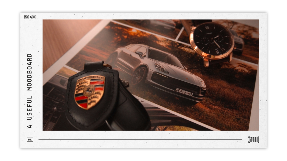
Making a moodboard can often be a great way to keep busy, without actually being productive.
Whether it be for photo inspiration, outfit ideas or even deciding on interior decor pieces, moodboarding often looks great and it feels like you’re working towards an idea. But when asked to make something of their own, a lot of people still struggle to put something together, despite all their inspiration.
The problem with most moodboards isn't the images or the moodboard app or the colour palette. It's that they are often so broad and unspecified, that you can’t extract anything useful out of them.
Most people build moodboards the same way: open Pinterest, save everything that looks vaguely right, screenshot a few things from Instagram, and throw it all on a canvas. Moodboarding like this is a great way to capture a feeling, but it doesn’t capture specifics. Without specifics, it’s very hard to take anything meaningful out of it that you can use in your own work or your own life.
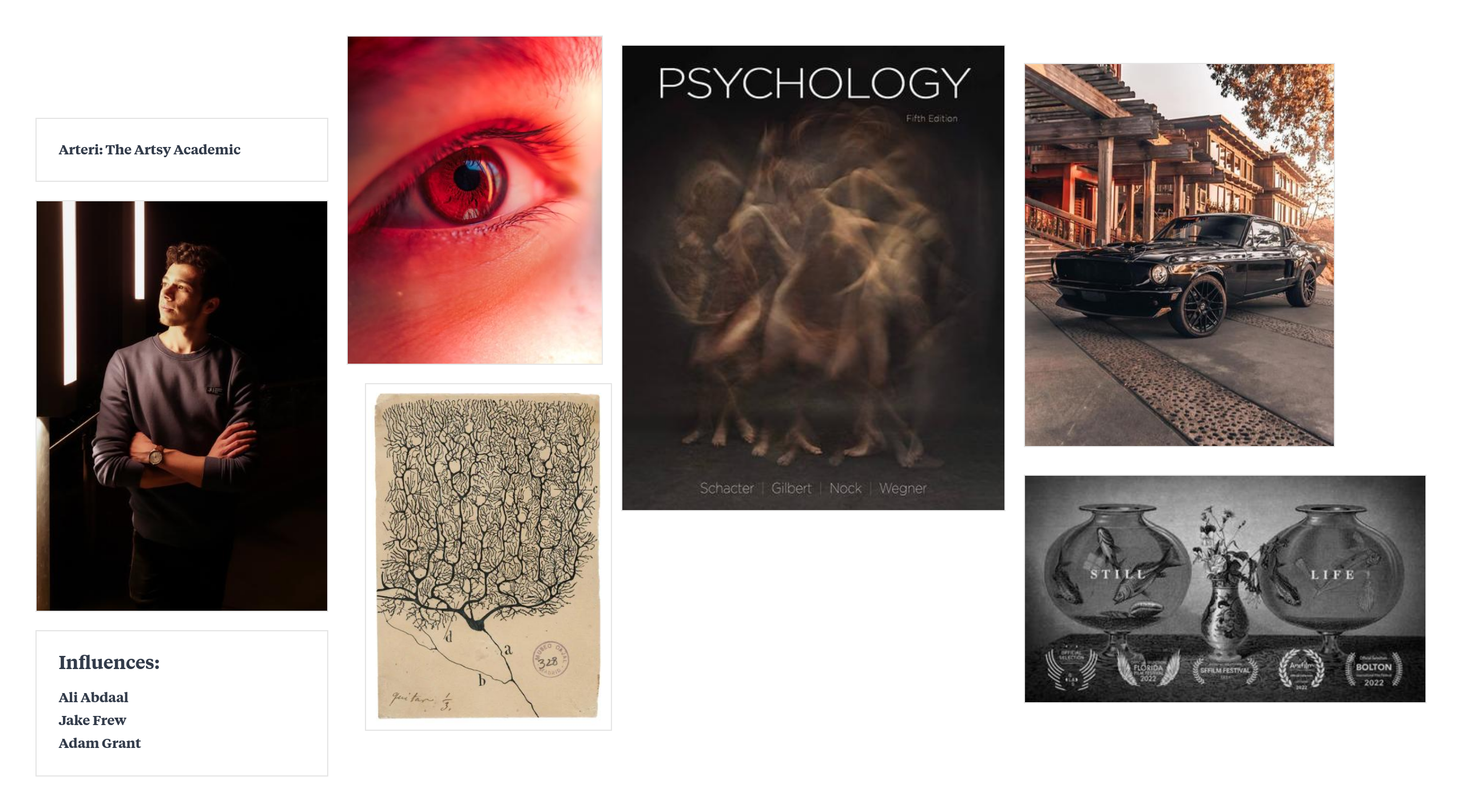
Back in 2024 I made a moodboard for my Arteri brand. It consisted of just six images, but somehow still informs and influences my work 2 years and 3.5 million YouTube views later. It works because it’s minimal in its approach. I didn't save forty things, I intentionally cut it down to six things that actually mattered. Things that gave me actual direction when it came to my aesthetic choices, i.e. warm tones, detailed imagery, vintage vibes, clean fonts, and an educational approach to sharing ideas.
A moodboard is not a “save” folder, don’t just keep adding until it feels complete. The more you add, the harder it gets to see what's actually consistent across all of it. You end up with a collection of things you like instead of a clear picture of what you're going for.
So, here’s an exercise to try:
Pick something you're working on or want to make (a video, an outfit, a space, whatever you’re interested in putting together). Find maximum five images/videos that already look like the version you're going for. For each one, think of at least one specific thing it's telling you. It can be colour, texture, typography, etc.
Those notes are your actual brief. Work from those and you might just be surprised at how close the end result ends up being to your actual taste.
See you in the next one ☕
-Arteri.