how to get the art deco look.
Have you ever noticed how things from the 1900's just look so cool?
I was recently flipping through some old photobooks in a local bookstore and couldn't help but notice how everything from cars, to buildings, to clothes just seemed to have so much more personality than the things that surround us today.
But one aesthetic that really stood out to me in particular was the art deco movement. Basically, the "Great Gatsby" aesthetic, often associated with the New York City high life from that era.
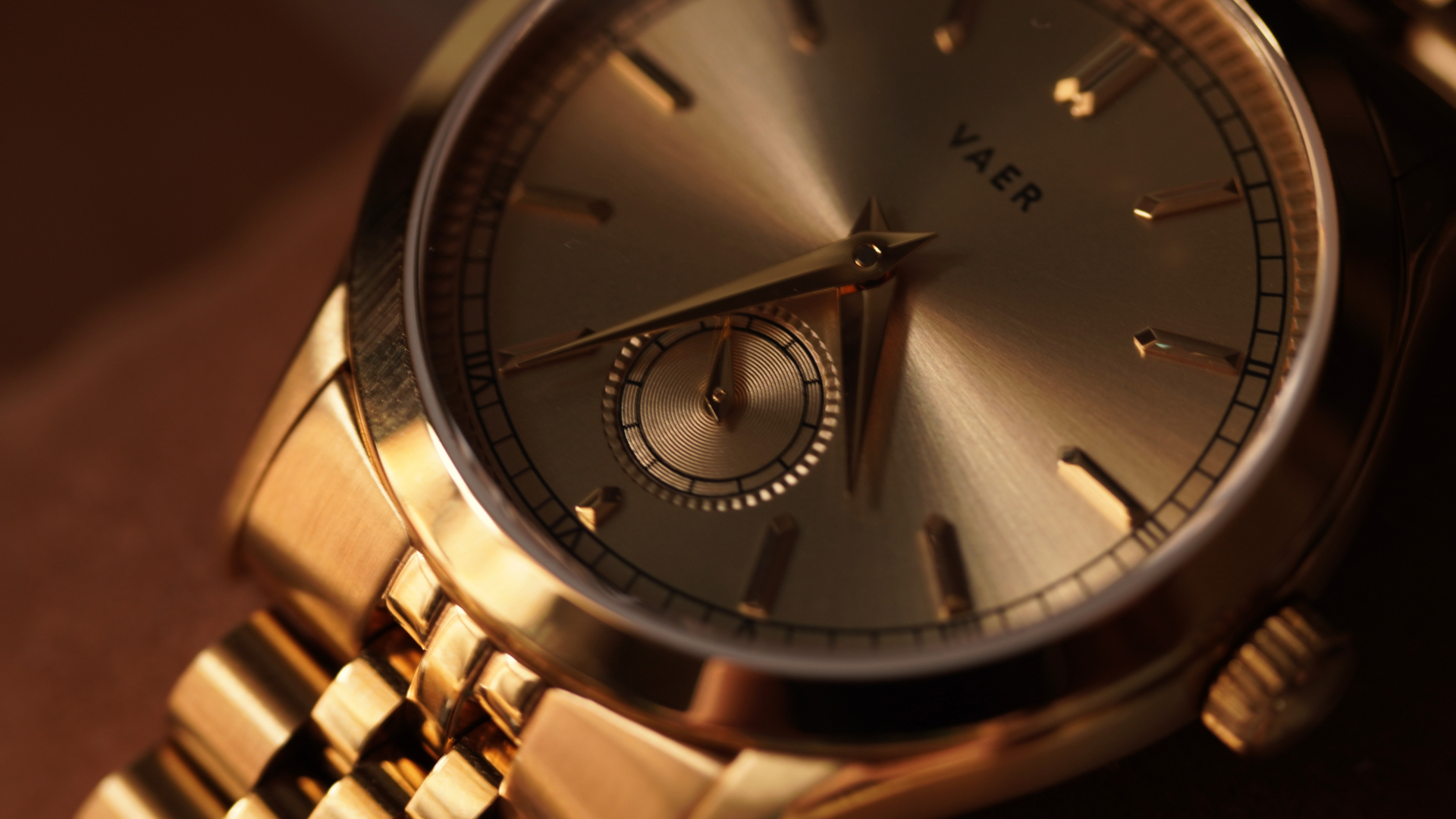
In recent years, the style has started making a bit of a comeback in the design world, particularly in areas like interior decor, luxury branding and watchmaking.
So, this week I wanted to "double-click" on the art deco aesthetic and just give out some tips on the design cues that you can follow, if you've ever wanted to incorporate it into a design or project of your own.
- Geometry
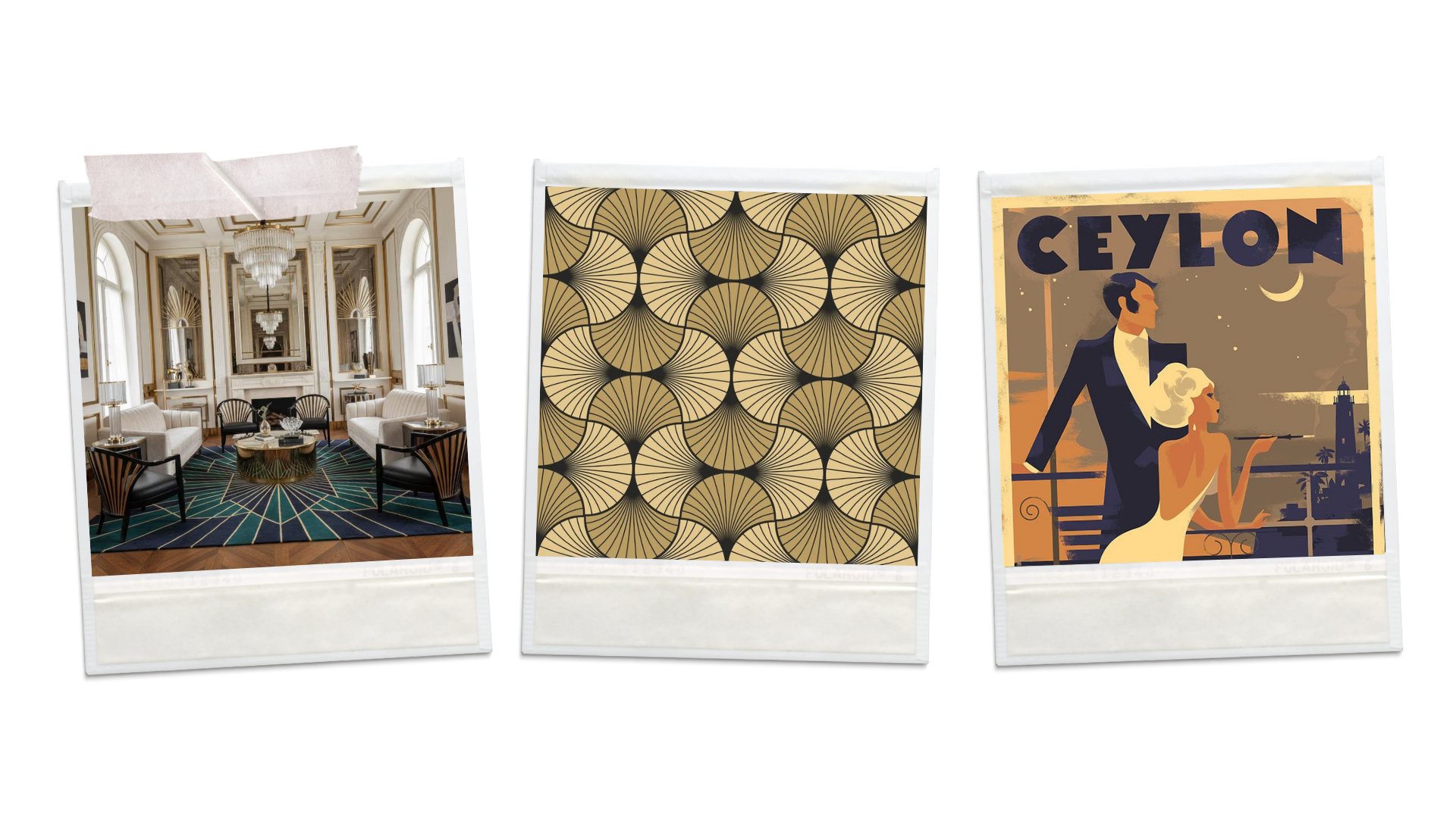
Some of the most distinct features of art deco include sharp lines and flat geometric shapes. Common shapes and motifs include sunburst rays, stepped pyramid shapes (also known as ziggurat shapes) and fan patterns. Repeating, symmetrical patterns are often used for large surfaces like rugs or wallpaper. - Colours & Textures
When it comes to art deco, technically any strong contrasting colour scheme can fit quite well, but there are a few colour palettes in particular that are strongly associated with this movement, namely:
Warm metallics, such as brass or gold.
Deep jewel tones, such as emerald green, sapphire blue or burgundy.
Black, often used as an accent colour to create contrast and lines. - Intricacy
Art deco, even though it is a very "flat" style, is not minimal. It often utilizes a lot of fine engraved lines, layered borders, small repeating motifs and generally leans heavy into ornamentation. The more you zoom in, the more you should find. - Typography
Art deco lettering usually also leans into this overall geometric style. Thick, bold, all-caps letters are frequently used, although tall, narrow letterforms also make an appearance through accent text. As an added note, Arabic numerals are often swapped out for Roman numerals to better fit with the overall geometric theme.
See you next week,
Arteri ☕